 Eduardo Roxius
In short
Following the merger of ERT and Bioclinica, Clario needed to bring more than 50 clinical-trial solutions under one brand. I worked across shared design practices, a shared design system, and product design.
I took responsibility for advancing the design system and supported other designers through critique and mentoring. My product work included the end-to-end redesign of BPMonitor, an app patients used at home to measure their blood pressure. Beyond BPMonitor, I consulted on many other projects and rebranded iSpiro, a spirometry application. By September 2023, more than 10 products were using the design system, and the BPMonitor redesign had shipped.
Overview
Clario’s products served patients, clinical-trial sites and . Bringing them under one brand meant working across established product teams, different technical foundations and existing interfaces. The design team supported both the shared system and the needs of individual products.
I joined hoping to learn from other designers, understand a large organization and grow toward management. My work combined responsibility for the design system, support for other designers, and hands-on product design. This case study is divided into the following sections:
- Part 1 Shared practices Critique and mentoring to develop design judgment.Retrospectives to build shared understanding.
- Part 2 Design system Shared components and guidance across products.Adopted by more than 10 products.
- Part 3 Product design End-to-end redesign of BPMonitor.Design consulting and rebranding across product teams.
Part 1 · Shared practices
Developing design judgment
Our design team worked on separate products. To build shared understanding and create opportunities to learn from each other, I led critique and retrospective sessions and mentored a junior designer and an intern.
The junior designer had a foundation in usability, so I focused on helping refine the visuals of his designs, as well as coaching him on the tools we used.
The intern was confident with the tools, but the complexity of the work sometimes made it difficult for him to make decisions. In one product, users had to review inputs before proceeding and provide a written justification for any values outside the recommended range. I encouraged him to explore different approaches to form validation. When we reviewed the alternatives, my questions helped him reflect on the options and identify the most promising approach himself.
Part 2 · Design system
Making shared decisions usable
The design system had to support products with different technical foundations, device constraints and existing interfaces. I led its design work, defining components such as buttons, forms and data tables, and working with product teams on how the new design language would apply to their products.
The definitions were accompanied by design guidelines and practices (Do’s and Don’ts). The guidance covered behavior as well as appearance: field errors belonged beside their inputs, and validation never relied on color alone. Each component’s documentation paired these rules with implementation references.
By September 2023, more than 10 products were using the design system, out of more than 50 it was planned to support.
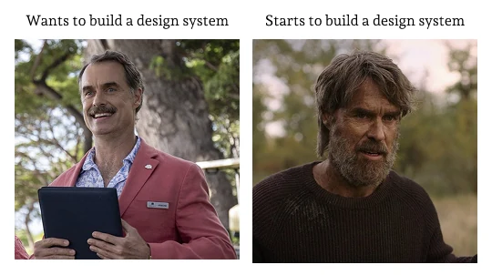
- Unclear decision ownership
We hadn’t agreed who could settle design choices across products. Without shared principles to guide those decisions, discussions returned to personal preferences and choices remained unresolved.
- Competing product priorities
Other designers had commitments to their own products, and we hadn’t agreed what time they could contribute to the design system. Shared work depended on availability that hadn’t been secured.
Part 3 · Product design
Designing clinical-trial experiences
BPMonitor: daily measurements at home
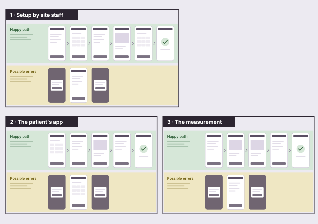
BPMonitor supported patients taking daily blood-pressure measurements during clinical trials, including older people using the app independently. I redesigned the experience end to end, from to the patient’s daily measurement.
The redesign combined clearer instructions, illustrations and larger buttons with guided preparation before each measurement. The home screen showed the next measurement and each session’s sync status, helping distinguish a completed measurement from a record that had reached the cloud. Device connection and internet availability were important constraints in the flow.
A representation, not the real app
Start a measurement with the button below.
Tomorrow
Monday
April 2
Before you start
- Keep the phone on until you finish.
-
Check that the monitor’s battery symbol isn’t flashing.
- Charge the phone to at least 25%.
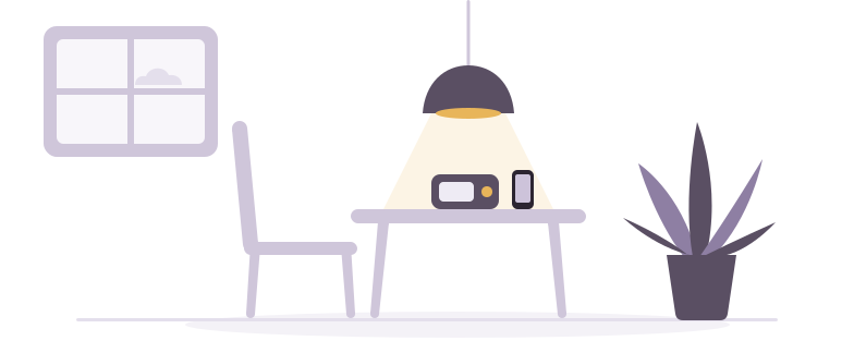
Find a quiet spot.
Sit at a table where your arm can rest.
Put the phone next to the monitor.
Measuring takes about 3 minutes after the rest.
Tap to go through each step.
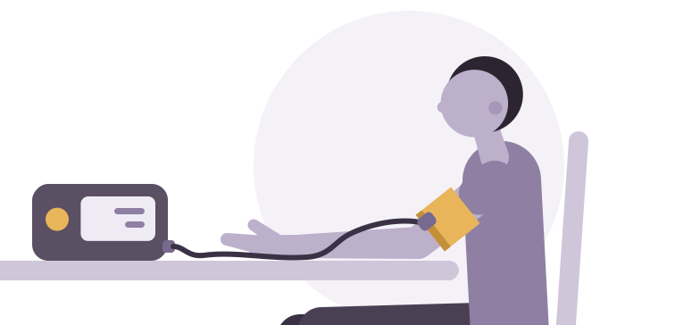
- Bare your left upper arm.
- Slide the cuff on, with its lower edge two fingers above the elbow.
- Snug, not tight: one finger should still fit under it.
- Run the tube down the inside of your arm, toward your palm.
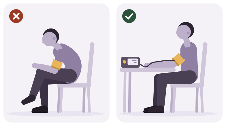
- Sit back against the chair.
- Feet flat, legs uncrossed.
- Rest your arm on the table, the cuff level with your heart.
- Let your shoulders drop and breathe normally.

Leave the phone next to the monitor.
Settle in. The video keeps you company for a few minutes.
When it ends, the measurement starts on its own.
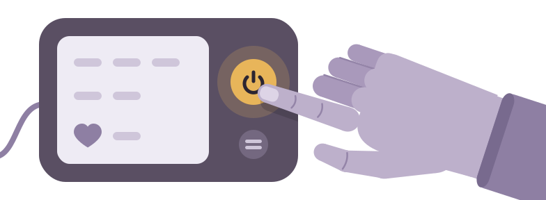
Press the start button on the monitor.
Keep your arm on the table and stay still while the cuff tightens.
Your reading will show here in a moment.
Leave the phone on until it’s saved.
Your reading is in, and on its way to your study site.
Tap when you’re done.
Research when patients are hard to reach
User research is difficult in healthtech: patients are not always available, and regulations require protocols for involving them. Without a team dedicated to recruiting them and staying in touch, designers have to find creative ways to do research. For BPMonitor, I tried the designs out with older people I knew and with others I judged to fit the target profiles.
Design support across other products
For Clario’s login platform, I worked with product and engineering on sign-in flows for users from different organizations. Workflow diagrams helped us guide users to the right sign-in route.
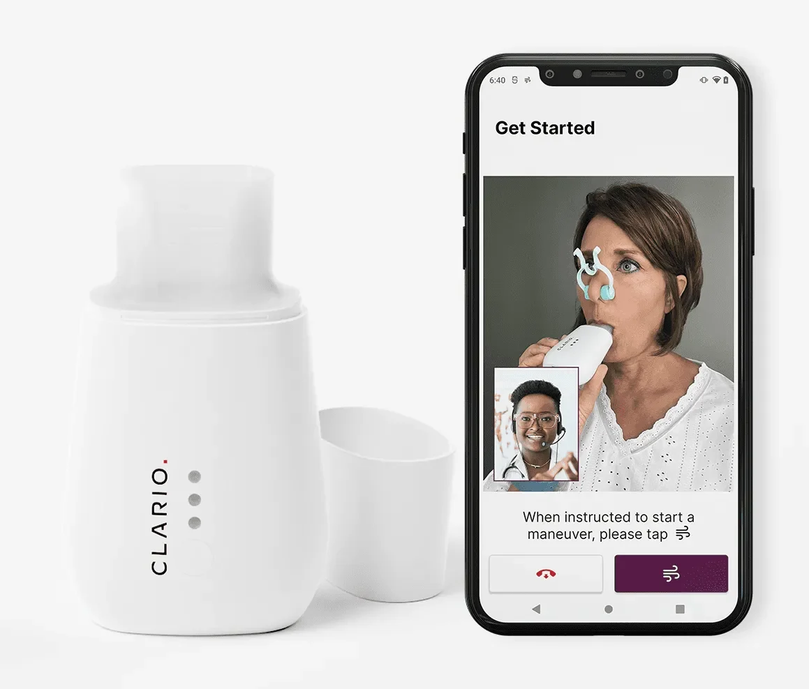
I rebranded iSpiro’s screens, typography and components, working with product and development to clarify requirements and implementation constraints.
Across other products, I reviewed rebrands with product managers. Dedicated devices and existing translations required adjustments to the shared design language and, sometimes, additional components.
A broader view of user needs
Alongside the product work, I helped the VP of Experience Design and colleagues develop a company-wide workshop for product managers and leaders. It focused on identifying and prioritizing challenges facing patients, sites and sponsors, with the aim of informing further research and product discussions.
- Gaps in communication
Early in BPMonitor, I wasn’t included in key project meetings, leaving me without context relevant to the design. I addressed the gap with the product owner and product manager.
- Limited research and impact visibility
In my healthtech work, regulatory requirements made user research harder to arrange, while data-protection constraints limited access to usage analytics. This reduced my ability to validate design decisions with patients and understand their impact in everyday use.
Looking back
What I would carry forward
Leadership meant building commitment across teams
I took on the design system before we had agreed on decision authority or how teams would participate. I would start by clarifying its value to each team and securing commitments around responsibility, time and involvement.
Mentoring helped others own their decisions
I asked designers to explain their goals and compare alternatives. Helping them work through that reasoning became a concrete way to lead and support their judgment.
Access to patients shaped what I could test
I encountered the realities of user research in life sciences and health-tech: difficult recruitment and the procedures required to involve patients. For BPMonitor, I tested with older people I knew and others who fit the target profiles.