 Eduardo Roxius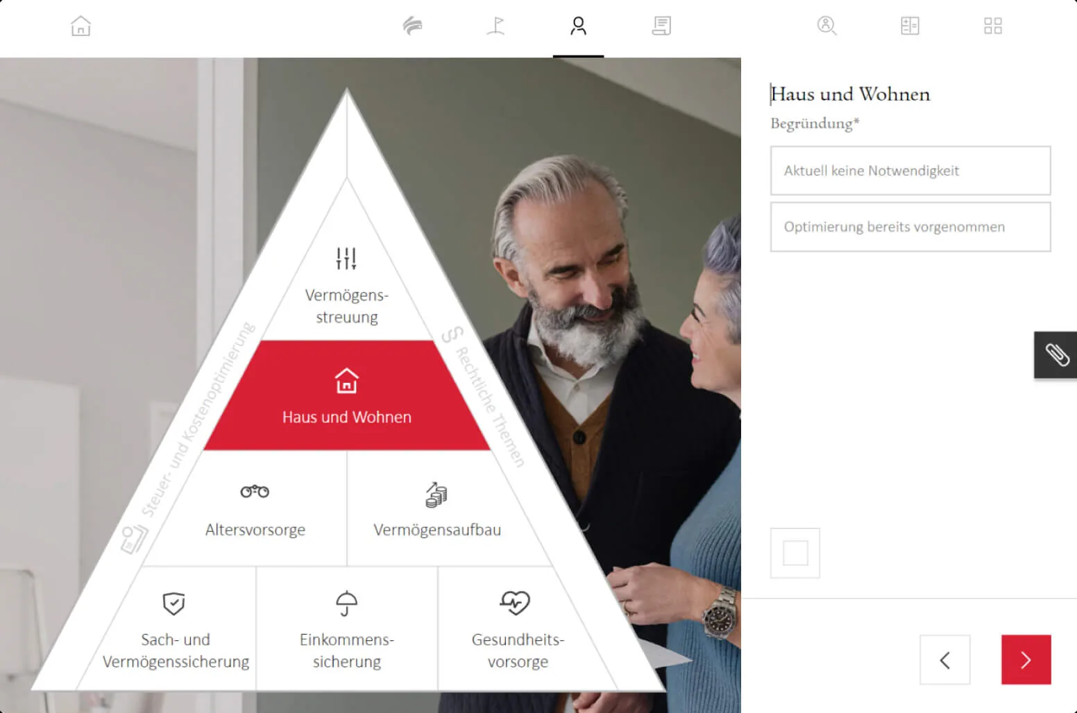
Financial planning is an act of imagination. You’re asking someone to care deeply about a version of themselves that doesn’t exist yet. That’s a hard sell when the medium is a stack of paper forms and a one-way monologue from an advisor.
Swiss Life, one of Switzerland’s largest insurance and pension providers, knew their advisory process wasn’t working for customers. The math was sound and the products were solid. The experience was the problem. Customers sat across from advisors while complex financial scenarios scrolled past in spreadsheets they couldn’t meaningfully engage with. After the meeting, advisors spent roughly two hours manually re-entering data from paper into digital systems.
The brief was to design a tablet-based tool that would replace this workflow. But the real opportunity was bigger: redesign the relationship between advisor and customer during the consultation.
The challenge
Financial advisory tools typically face a tension: the advisor needs depth and precision, while the customer needs clarity and emotional resonance. Most tools resolve this by building for the advisor and hoping the customer can follow along. That approach preserves professional control but sacrifices engagement.
- Low customer engagementPeople couldn’t feel how today’s decisions affected their future. Long-term implications remained abstract.
- Manual data entryPost-consultation re-entry consumed about two hours per meeting, adding friction without adding value.
- No shared visualsWithout a shared surface, customers left uncertain about what had actually been discussed and decided.
From tool to shared experience
Early concepts followed the expected path: a digitized version of the existing workflow, with the advisor driving and the customer watching. It was cleaner than paper, faster than spreadsheets, but it didn’t change the fundamental dynamic. The advisor was still performing; the customer was still an audience.
The pivotal shift came when we reconceived the tablet not as the advisor’s tool, but as a shared surface. Instead of the advisor entering data while the customer watched, both participants could see and interact with the same information simultaneously. The tablet sat between them, literally and metaphorically, as a collaborative object.
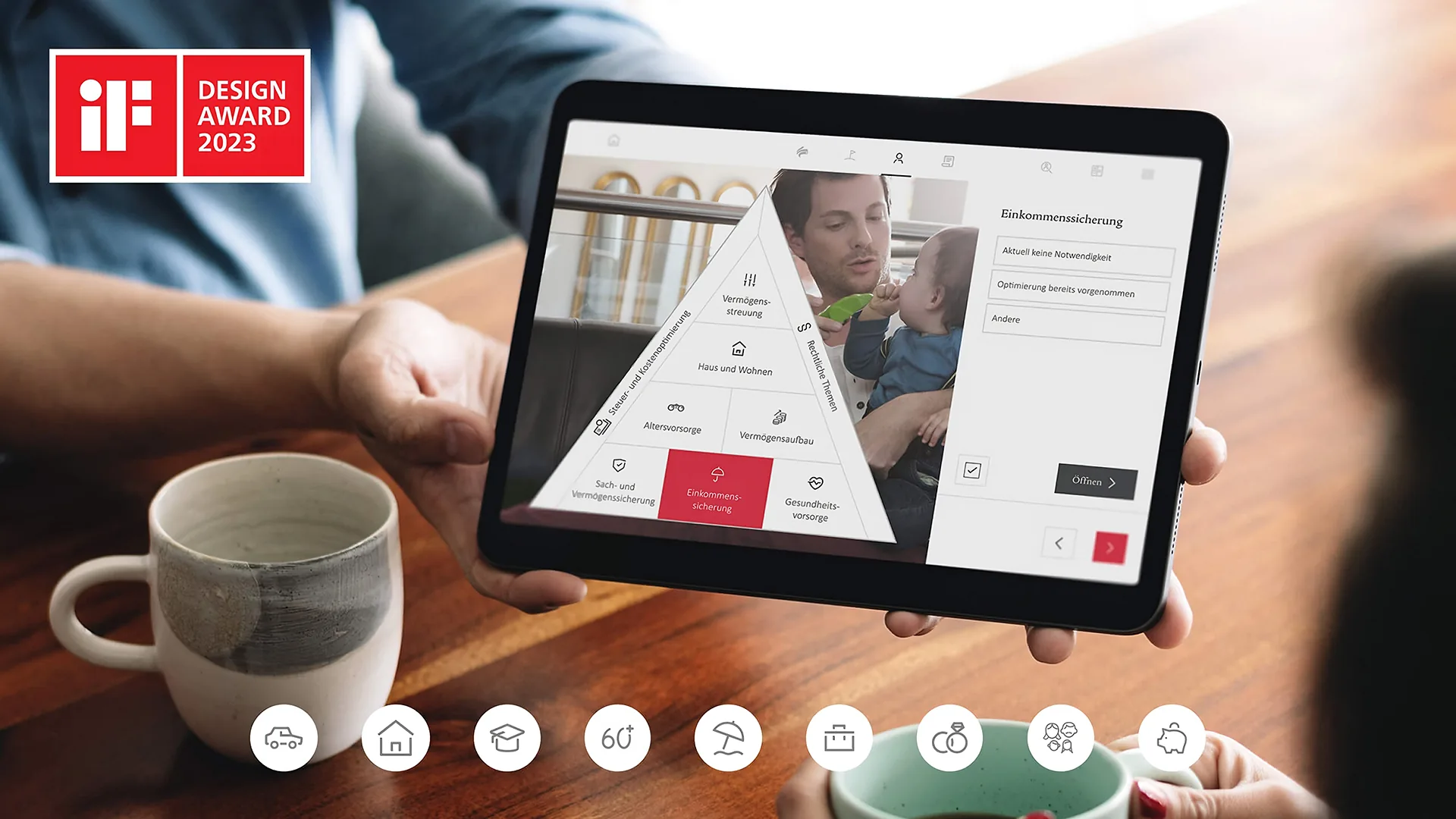
When financial scenarios update in real time as inputs change, the conversation shifts from explanation to exploration. The customer isn’t being told about their future; they’re building it.
Designing for the space between two people
- Orientation and legibility
Screen orientation mattered; the interface needed to be legible from both sides of a table. Information hierarchy had to serve two different cognitive modes: the advisor thinking in products and premiums, the customer thinking in life events and emotions.
- Active participation
We ran rapid prototyping cycles, testing with real advisor-customer pairs. Customers who could directly manipulate variables asked fundamentally different questions than those who watched. They stopped asking “what do you recommend?” and started asking “what happens if…?” That shift, from passive recipient to active participant, was the design’s real success.
- Real-time feedback
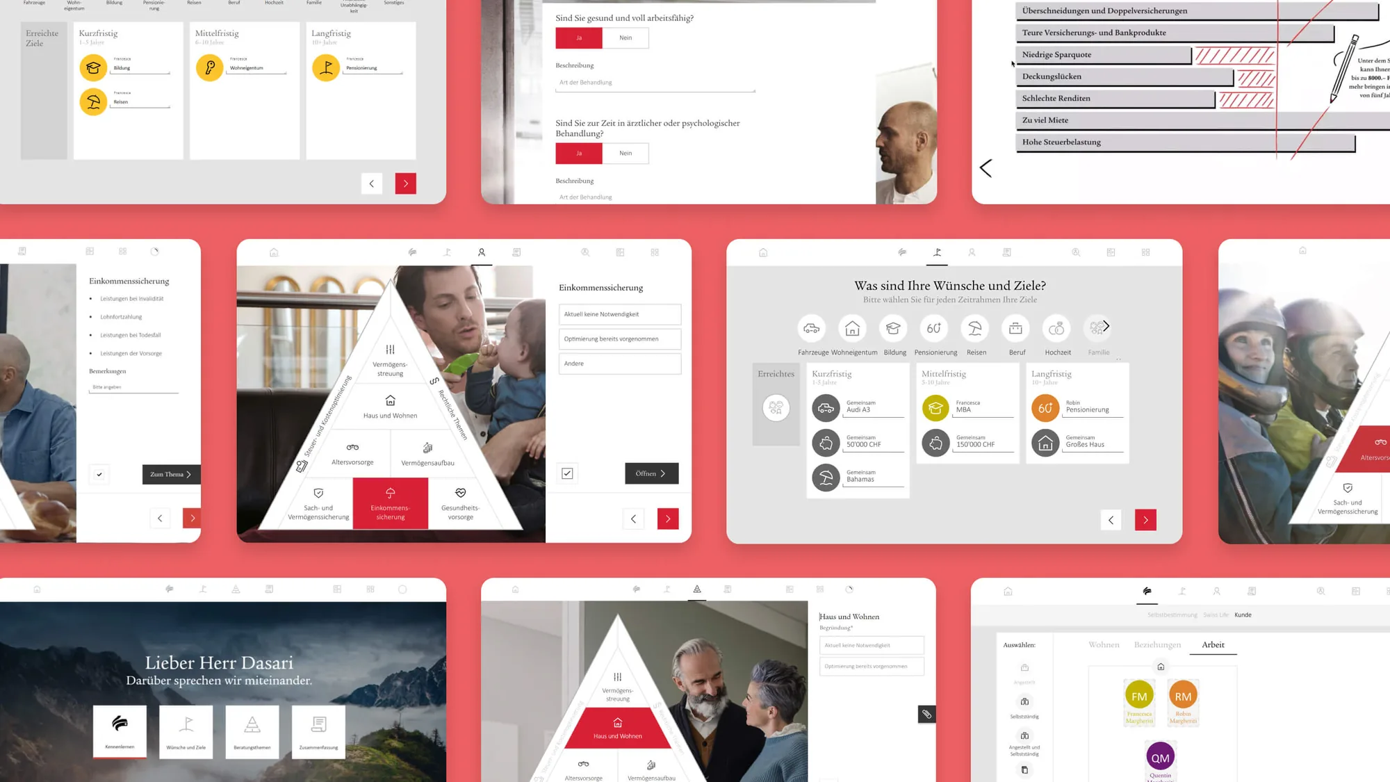
The visual language leaned heavily on immediacy. Change an input, see the outcome move. Not after a loading screen, not in a separate results tab, but immediately in the same view.
It’s much easier to explain financial topics when customers can see everything change in real time.
Financial planner, Swiss Life
Impact
Advisors saved approximately two hours per consultation by eliminating manual data re-entry. Hundreds of advisors across Switzerland adopted the tool, and customers who could see and shape their financial future were more likely to commit to a plan.
- Double-digitConversion increase
- ~2 hoursSaved per consultation
- HundredsOf advisors across Switzerland
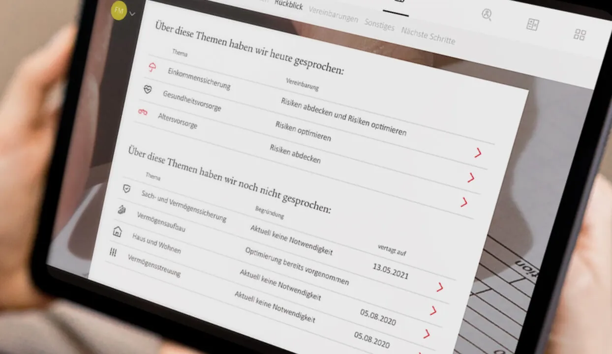
We ended up improving the experience a great deal — for both customer and financial planner.
Marius Gafner, Head of Digital Products, Swiss Life

Reflection
- What I’d do differently
The collaborative interaction model was the right call, but there was room to push the emotional design further. Financial planning is fundamentally about hopes and fears: retirement dreams, worst-case scenarios, providing for children. The tool handled the rational layer well, but there was room to design for the emotional texture of those conversations.
- What I learned
The most powerful design decision wasn’t a visual or an interaction. It was choosing who holds the tool. Putting it between people instead of in front of one person changed everything downstream.